Wireframe – OVERVIEW / WRAP UP (mock up)
OVERVIEW / WRAP UP
ALL PAGES + SUB-PAGES as ANCHOR LINKS
Overview / Wrap Up:
9/2/2025 [ David Jamison ]
Add Overview and Notes Here:
HOME PAGE: (1)
Quick punch-list (so they “get it” in 10 seconds)
- Hero (ABOVE THE FOLD)
- H1: “Map crypto influence. Rank KOL credibility. Act with signal.”
- Sub: 1 line on AI Trust Layer + chains covered.
- Primary CTA: “Explore Leaderboards” Secondary: “Lock Founders $99”
- Tiny proof row: “Backed by live on-chain + cross-platform signals”
- Value blocks (3 tiles)
- “Trust Layer (anti-hype scoring)” — short bullets (bot-filtering, engagement depth, post→move correlation).
- “Leaderboards by chain & tier” — show dropdown pills (Sui / ETH / SOL / Base).
- “Watchlists & Alerts” — rising/flat/falling traffic lamps.
- Social proof / credibility
- Logos or simple text badges: “Built for agencies • funds • KOLs”
- Micro-stat row: “Signals refreshed every 24h • 90d history • multi-platform”
- Live-ish modules (static in mock, looks alive)
- Trending KOLs (top movers snapshot) — 6 snapshot cards.
- Latest Posts (social feed strip) — 4 compact rows.
- Mini Leaderboard (top 10) — last 3 rows blurred (freemium gating).
- Founders CTA band
- “$99 Founders — locks for life (pre-launch 90 days)”
- 3 bullets: full leaderboards, unlimited watchlists, AI Trust Layer.
- Footer quick nav
- Product • Leaderboards • Pricing • Docs/Methodology • Contact
Micro-tweaks that sell the concept
- Keep the traffic signal legend pinned once (Green/Yellow/Red).
- Use blurs on certain rows/cards to telegraph the freemium → Founders jump.
- Include timeframe chips (24h • 7d • 30d) even if they don’t switch in the mock.
- Add chain filter pills at the top of Trending + Leaderboard (SUI pre-selected).
Copy suggestions (drop-in)
- Hero H1: “Cut through hype. Rank real influence.”
- Sub: “KOLRadar scores crypto creators with AI—across chains, platforms, and time—so you can pick partners and positions with confidence.”
- CTA buttons: “Explore Leaderboards” • “Lock Founders $99”
- Section headers:
- “Trending KOLs (Top Movers)”
- “Latest Posts Across Your Watchlists”
- “Mini Leaderboard — Sui (24h)”
What I’ll look for on your page (fast QA)
- Above-the-fold value prop + CTA visible on first scroll.
- Consistent dark theme, chain pills, score/eng Δ/velocity triplet.
- Gating blur in at least one module.
- Founders CTA band before footer.
- No dead-end: every module should hint at a deeper page (“View Full Leaderboard”, “Open Profile”, etc.).
DASHBOARD PAGE (2):
 Dashboard Wireframe Narrative
1. Hero / Header Row
- Title: “Your Dashboard”
- Sub: Quick summary (active watchlists, campaigns, alerts triggered today).
- Timeframe filter (24h • 7d • 30d).
2. KPI Tiles (Top Row)
- Watchlists count (e.g., 3 active).
- Campaigns (e.g., 2 live, 1 draft).
- Alerts fired today (green/yellow/red breakdown).
- Avg ROI across campaigns.
(Think: 4 small metric cards at the top — gives Levi a social-style “snapshot”.)
3. Core Modules (Center Pane)
- Trending KOLs (Top Movers Snapshot)
- 6 snapshot tiles, sortable by chain (default SUI).
- First 3 visible in freemium, bottom blurred.
- Traffic Indicators (Signal Lamps)
- Table view with green/yellow/red status.
- Timeframe toggle + search.
- Latest Posts (Social Feed Integration)
- Pulls in X/Twitter or KOL-linked posts.
- Mini avatars + snippet, click to open profile.
4. Watchlist Preview
- Quick grid of the user’s watchlists.
- Each card: title, # of KOLs, signals this week.
- CTA: “Open Full Watchlist.”
5. Campaign Snapshot (if Agency/Brand role)
- Mini row showing live campaigns with spend vs budget.
- CTA: “View Campaigns.”
6. Founders CTA Band
- “$99 Founders — locks for life.”
- Mini bullets: unlimited watchlists • traffic signals • deep stats.
 Why This Works For "DEVELOPERS" (and Crypto Peeps)
- Shows modularity: each block = standalone module (he can envision how to wire data APIs to each).
- Freemium gating visible: blur treatment in Trending KOLs + Leaderboard previews.
- Logical nav flow: everything has a CTA to its deeper page (Profiles, Watchlists, Campaigns).
- Role awareness: if logged in as KOL vs Agency, Dashboard highlights different panels.
 Suggestion:
I need to CREATE a 2–3 line “tour guide” explainer for each page:
Here’s the Dashboard wireframe. The idea is to show a user’s ‘command center’ — quick metrics at top, trending signals in middle, and direct CTAs into Watchlists / Campaigns. Blurs handle freemium gating, Founders CTA is always visible. Each block connects to its detailed page in the sitemap you already reviewed.
LEADERBOARD PAGE (3):
Leaderboard Thoughts...
KOL PROFILES (4):
Thoughts...
WATCHLISTS (5):
Thoughts...
CAMPAIGNS (6):
Thoughts...
ACCOUNT / ONBOARDING (7):
Thoughts...
WRAP UP [ ALL / OTHER ADDITIONS? ] (8):
Thoughts...
Links to Google Docs & other Project Docs:
- ~
- ~
- ~


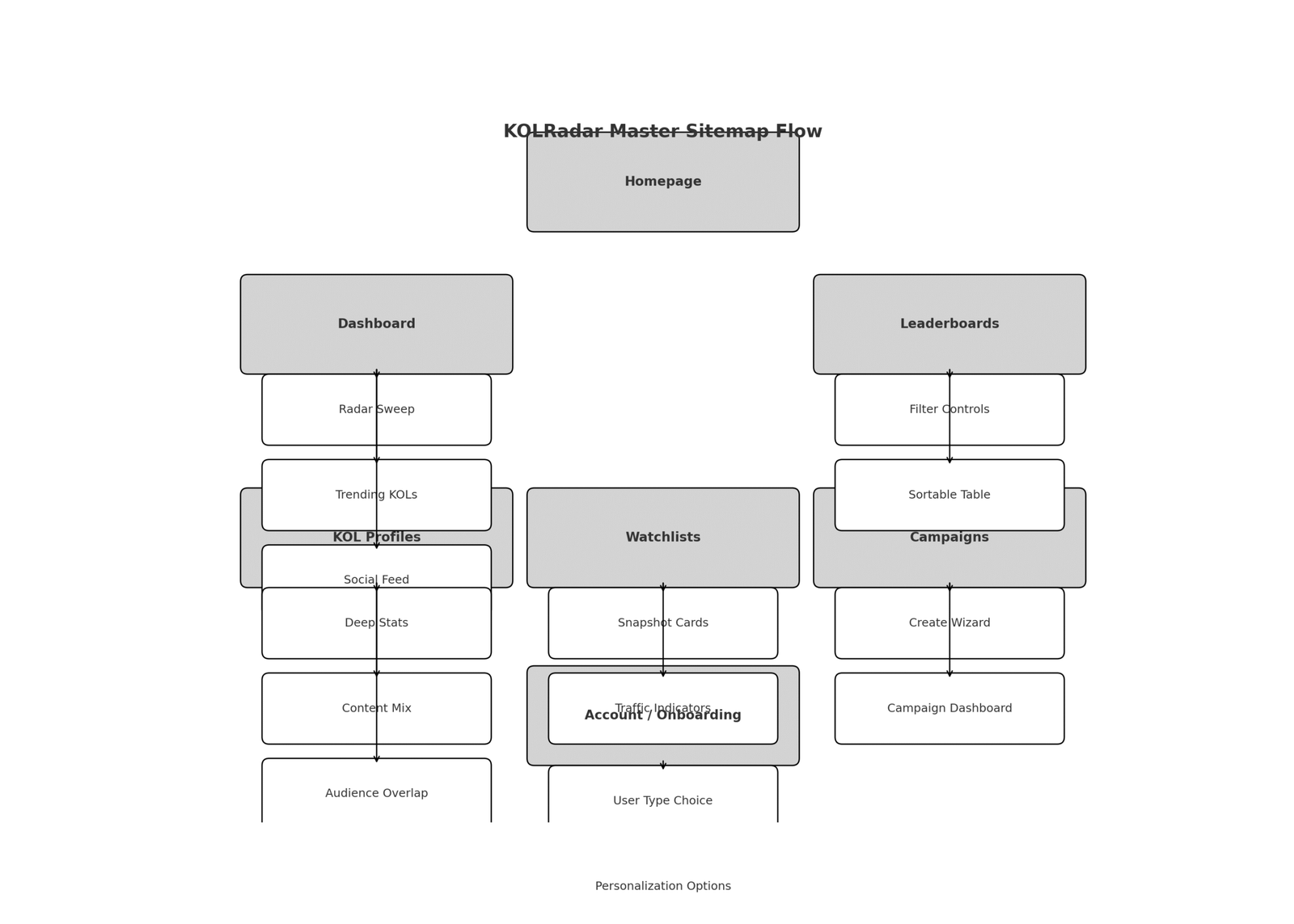
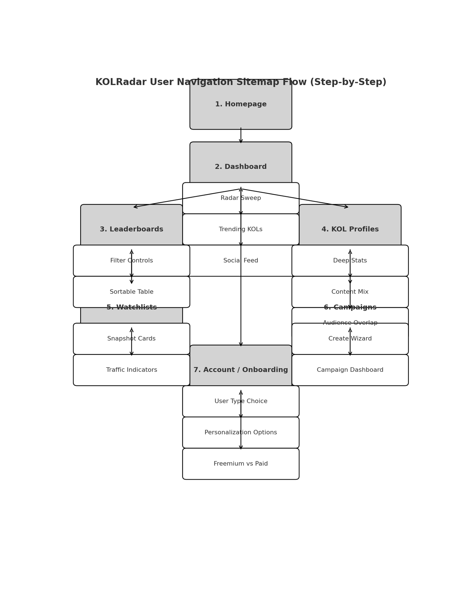
 Mockup Site Structure for DEVELOPER
Homepage (Step 1)
- Hero: Tagline + CTA (Explore Radar / Join Now)
- Background: Radar sweep (static or video)
- Buttons: “View Dashboard” → takes you to the MVP directory
Dashboard (Step 2)
- 3 Big Modules:
- Radar Sweep (data blips)
- Trending KOLs (top movers snapshot)
- Social Feed (latest posts integrated)
Leaderboards (Step 3)
- Filter controls (chain, category, verified toggle)
- Sortable KOL table (Reach, Engagement, Velocity)
KOL Profiles (Step 4)
- Deep Stats (graphs)
- Content Mix (pie chart)
- Audience Overlap (Venn diagram)
Watchlists (Step 5)
- Snapshot cards (KOL tiles)
- Traffic Indicators (green/yellow/red signals)
Campaigns (Step 6)
- Create Wizard (Step 1 → Step 2 → Step 3 flow)
- Campaign Dashboard (ROI metrics, graphs)
Account / Onboarding (Step 7)
- User Type (Retail / KOL / VC / Agency)
- Personalization Options
- Freemium vs Paid Comparison


